The Data for Progress Ratio Tracker
Every Senator. Every Tweet. Every Brutal Ratio.
Jason Ganz, Jon Green, Colin McAuliffe, Sean McElwee, and Avery Wendell

Twitter occupies a relatively small share of the American public, but counts essentially every public figure among its daily active users. As much of elite communication takes place on this online platform, we at Data for Progress feel that it is important to provide some insight on how political elites use the platform, and how their audiences respond. In this spirit, we will be providing periodic analyses into various aspects of the Twittersphere.
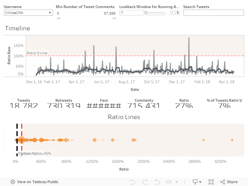

Our first installment is The Ratio Tracker. Discourse analysts have established the concept of the Ratio -- defined here as the number of replies to a given tweet divided by the number of likes. While the Ratio is a rough metric, it is generally accepted as an indicator of a tweet’s quality. If you’ve sent a tweet that more people have commented on than liked, there’s a good chance that Twitter has judged the tweet to be substandard. Data for Progress has collected every tweet between January 1, 2017 and April 18, 2018 from each Senator to see how often they get ratio’d and how their ratio changes over time.
A few notes: For Senators with two accounts, we used the more followed and frequently tweeted from account. We also included Chris Cillizza--who Know Your Meme credits, in part, for giving rise to the concept. You can use the tool below to filter by the number of comments, adjust the calculation of the running average and search for specific words and phrases. Happy hunting!
Our Latest Work


